Table of Contents
*This post may contain affiliate links. As an Amazon Associate we earn from qualifying purchases.
Your Base Strategy Is Your Logo’s Foundation
Essentially there are 5 core business strategies that inspire logo design. Business leaders spend countless hours in building your brand

A logo reflecting the passion and drive to deliver the best product is a challenge as you launch and relaunch your brand in a rapidly changing business environment.
It’s a fact, people relate to visual images more than they do to headlines and copy. As the face of your company, your logo needs to be recognized and associated with your customer promise.
Today there are great apps, such as Logo Creator and Logo Maker, to walk a small business through the design process. Do not take the process lightly. Logos take a lot of strategic thinking to become the force that drives home your message.
Here are examples of how great brands, with distinctly different base strategies, created a logo that set them apart for all others
[amazon fields=”B00AAIYW4W” value=”thumb” image_size=”large” image_align=”center”]
[amazon fields=”B00AAIYW4W” value=”button”]
Airbnb Customer-Focused Strategy Shines Through

Exceeding customer expectations and building your brand around the customer’s voice is the goal of a company that leads with putting the customer first.
There are many levels of customers: the buyer, the employee and the stakeholder.
The home sharing company airbnb is an example of a customer-driven organization. To encapsulate this spirit they redefined their brand and created a new logo that they defined as a symbol of belonging.
Here is the thought process behind the organization’s logo design.
The elements of the logo, which they named a Bélo, represents Love, People, Places, and A for Airbnb.
If the face of your company reflects a high level of customer service, it is important that you stand behind your claim.
Employees should be empowered to act upon complaints quickly when your logo communicates love, people and places!
It is important that they deliver to both the guest and host customer segments.
In the case of airbnb, logo design is more than a symbol, it’s what they are committed to as a company.
Amazon’s Service Driven Logo Delivers A Smile
Service driven companies often are in industries that may not be able to differentiate products based on price, technology, or quality.

To overcome these obstacles, service- driven companies often focus on value-added benefits.
Examples of value-added benefits are fast delivery, packaging, guarantees, saving time, convenience and other benefits that are important to your customer.
Sounds like Amazon, doesn’t it?
Does anyone remember that Amazon started out as a site that sold only books? Their logo was an A with a flowing Amazon River. Why?
Back in 2000, Jeff Bezos wanted to transform the company to a store ‘that sells everything’. As part of the rebranding, value-added offers were created, and a new logo was developed.
https://youtu.be/WoFd4bjrtbA
The now famous yellow line inverted into a smile under the Amazon name was born. The agency that developed the concept had the great idea of printing the smile logo on every delivery box, creating millions of impressions per week.
Who doesn’t like being greeted with an Amazon smile at their front door? The logo truly is the face of the company. Their level of service backs it up.
[amazon fields=”B003QMLHW4″ value=”thumb” image_size=”large” image_align=”center”]
[amazon fields=”B003QMLHW4″ value=”button”]
Disney’s Quality Focus Puts Us In A Happy Place
Quality driven companies focus on continuous improvement and having highly-trained people, processes and systems in place to consistently exceed customer expectations.
Disney is consistently named among the top companies worldwide that deliver superior quality.
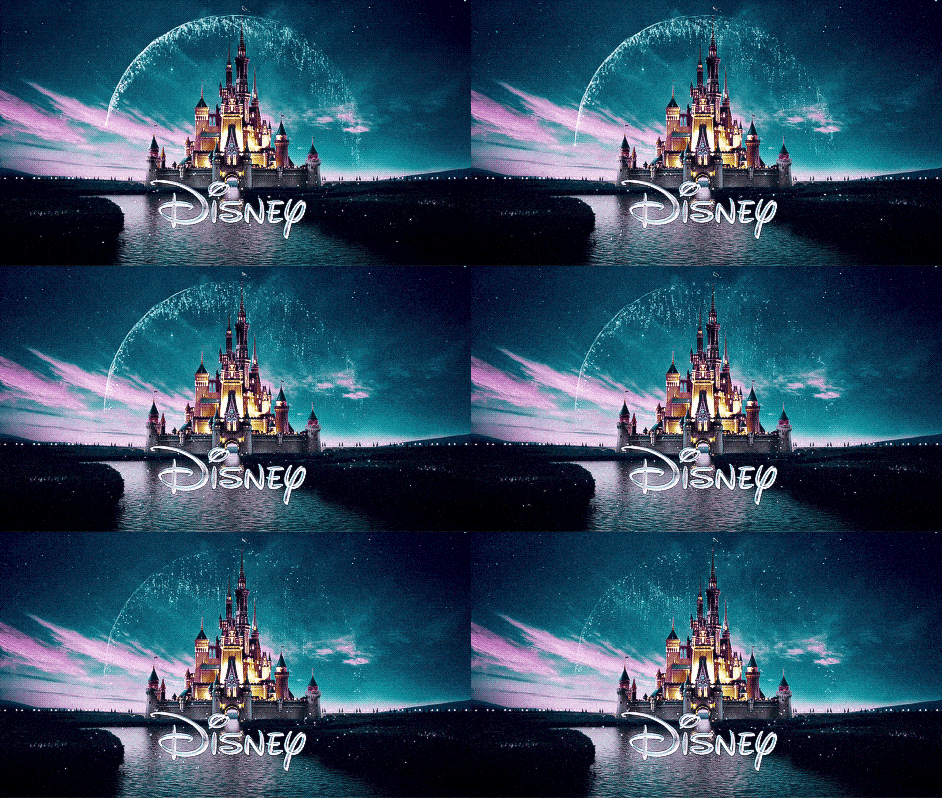
While the Disney organization is known for many product divisions, in 2000 their logo was designed solely focused on the theme park’s Cinderella’s Castle.
This symbol conjures up thoughts of a fairy tale world that provides the highest quality entertainment to their core audience, children.
No other company offers the experience of Disney. When we see their logo, the message is clear.
 Being a leader in animation, a shooting star, over a night sky, leading viewers towards the theme park, was added to stir the imagination and draw children and parents in.
The typeface was specifically developed to be uniquely recognized with the castle backdrop, or as a stand-alone image.
With everything the Disney company does, high-quality customer experience is their driving force. If your focus is on having a product or service that is superior in your industry, being able to capture the customer experience in your logo is the ultimate goal.
Salesforce Tech Driven Logo Puts Our Success In The Cloud
Developing a unique technology to gain a temporary monopoly on a market is quite an achievement. It requires constant breakthrough thinking.

A tech-driven focus requires a huge investment in money, research and development, or creating strategic partnerships with companies that have advanced technology but are not selling in your industry.
A continuous process of measurement and improvement are among the greatest challenges.
One of the best cloud computing companies that offers customer relationship management (CRM) products has created a simple logo that says it all.
Here’s the story of Salesforce.com and the creative strategy behind their logo. The video is a little long, however, it demonstrates the amount of high-level thought that goes into developing a tech-driven logo design.
Simple logos are the hardest to develop. It took the Salesforce founders years of product development, company acquisitions, and creative executions to come around to a simple design that speaks volumes.
Avis Overcomes A Commodity Position To Shake Up An Industry
Commodity brands often chose pricing or value as a differentiating factor, because they are essentially the same as others in their market.

For many years I developed marketing for Avis, a commodity brand in the rental car industry. Way before I arrived, an ad agency famously took a risk and used the companies’ number two market share position to develop the “We Try Harder” tagline.
During my tenure at the company, the Avis logo was consistently ranked as one of the top ten most recognized logos in the world. That gave the company a great advantage.
The Avis marketing team continually sought out new customer segments. This helped to position our products and services in the launch and growth stage of the product life cycle.
Using the ‘We Try Harder’ tagline, AVIS is able to differentiate a commodity service from their competitors and work with partners in a fun and creative ways. Here is a current example:
When AVIS was employee owned, for a 10 year period, we had a great time touting the fact that we try harder because We Own The Place. The strategy boosted employee morale, customers rooted for our success and competitors couldn’t match the message.
In the rental car industry, profit margins are low. Through aggressively working every marketing partnership, launching new products, and providing the highest level of service to business and leisure customers, AVIS steadily increased volume to achieve financial success for all.
The Operations team focused on controlling internal costs and maintaining high productivity standards. In a commodity business, this is the recipe for success.
If you can develop a simple logo that communicates the efforts of the team to bring the customers low price and great service, a marketers’ job is half done.
As you develop your brand game plan, be conscious of how you will use the strategic elements of your brand to create a logo. Deciding on your base business strategy is the first step to logo development success.
[amazon fields=”B00AXSYQLS” value=”thumb” image_size=”large” image_align=”center”]
[amazon fields=”B00AXSYQLS” value=”button”]

